THE BRIEF
Operto needed a brand identity that showcased all of the services they offer as a B2B company that provides remote monitoring for property managers: keyless guest entry, experience customization tools, and remote technology controls.
THE SOLUTION
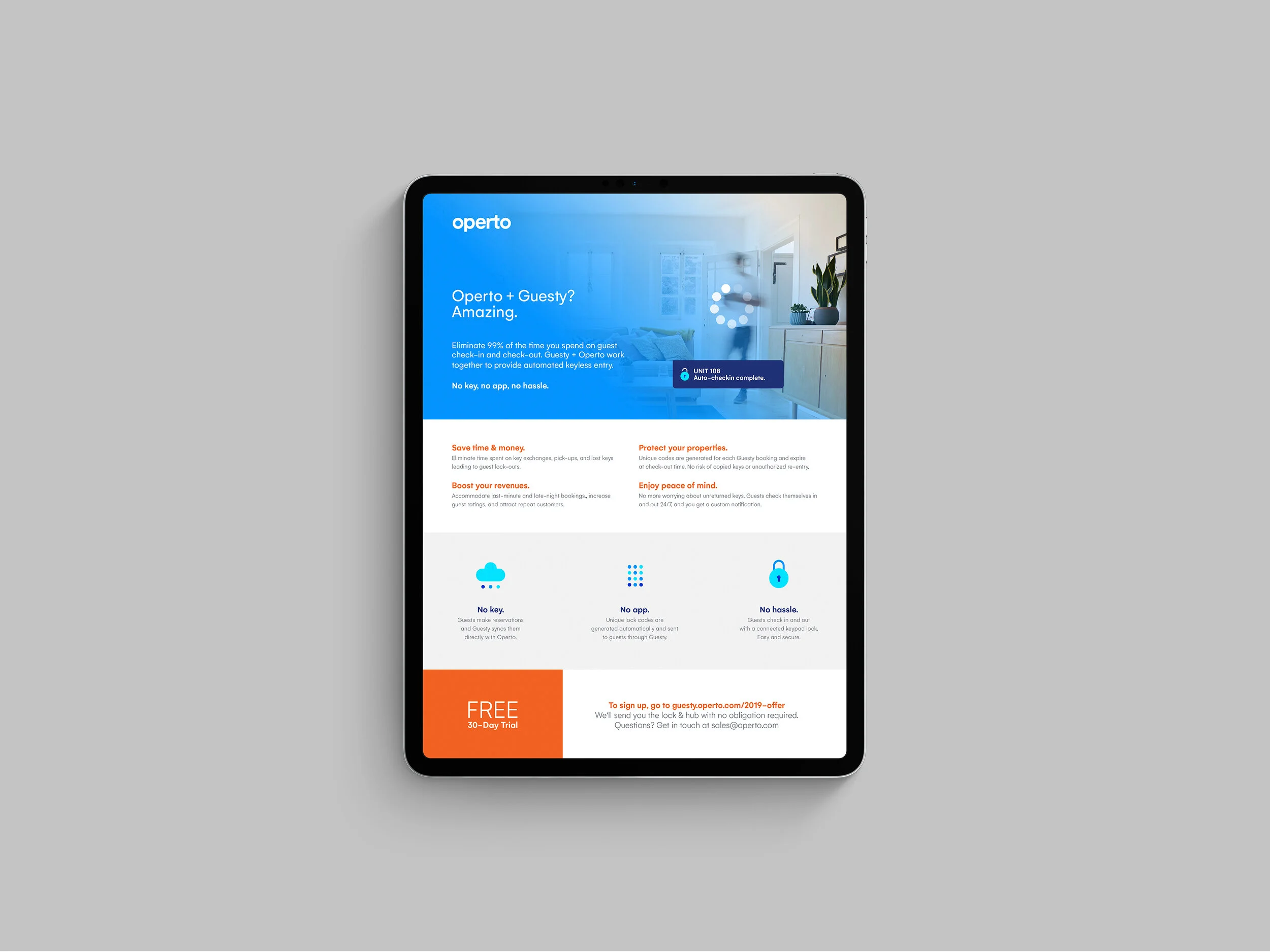
The Operto logomark references the linking of technologies through the joining of characters in the logo, and varying shades of blue offer a sense of security and trustworthiness. The concept of interlinked technologies is further supported by the system of graphic devices and icons that speak to the interconnected technology monitoring and customization experience offered by Operto. The brand’s seamless integration into any given space where their services might be used is further reinforced by the use of gradient image overlays.


