THE BRIEF
With Steam Teahouse & Café’s new ownership, expanded offerings, and a brand new space, this local independent tea shop needed a full refresh. The client wanted to elevate the brand and expand from a small tea shop to a full service café. They wanted the shop identity to feel established and cool, but not unapproachably so. They also wanted to emphasize the quality and artful balance of their tea blends while remaining true to themselves with a little dash of humour.
THE SOLUTION
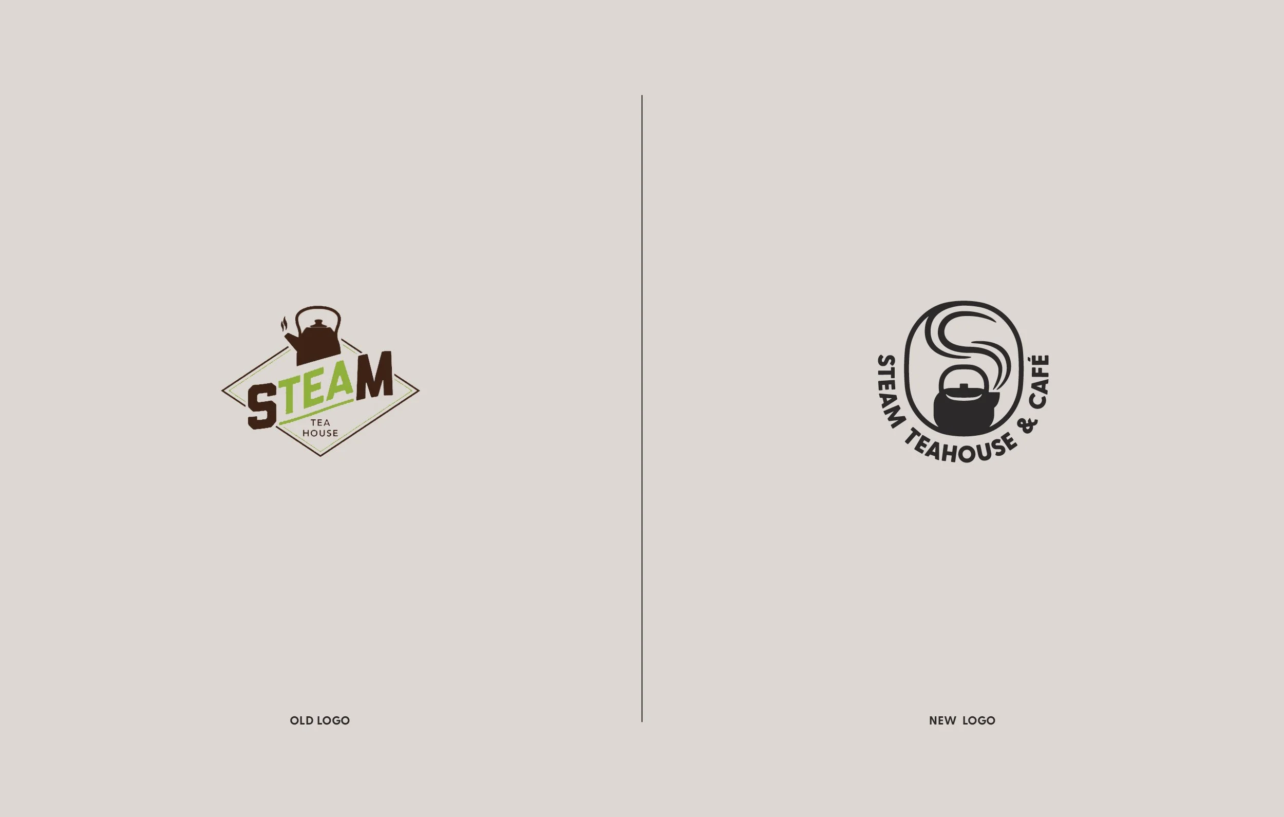
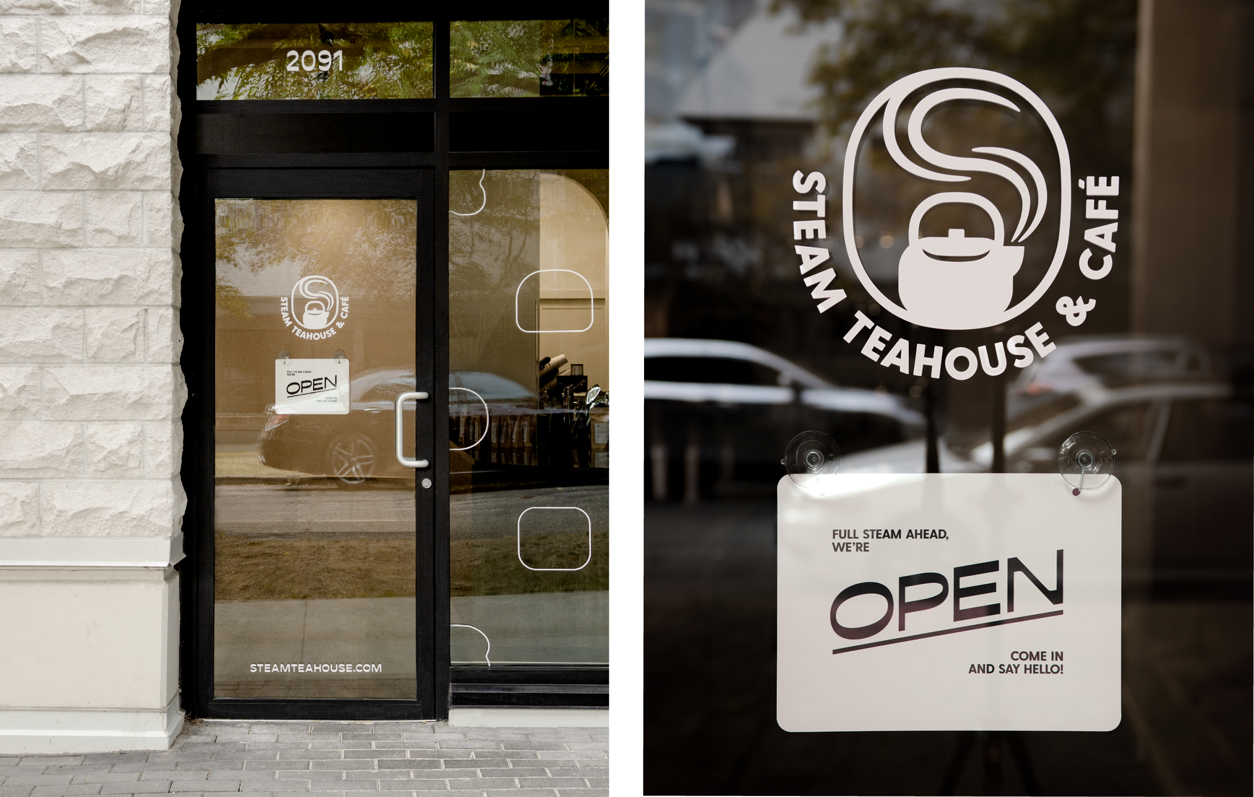
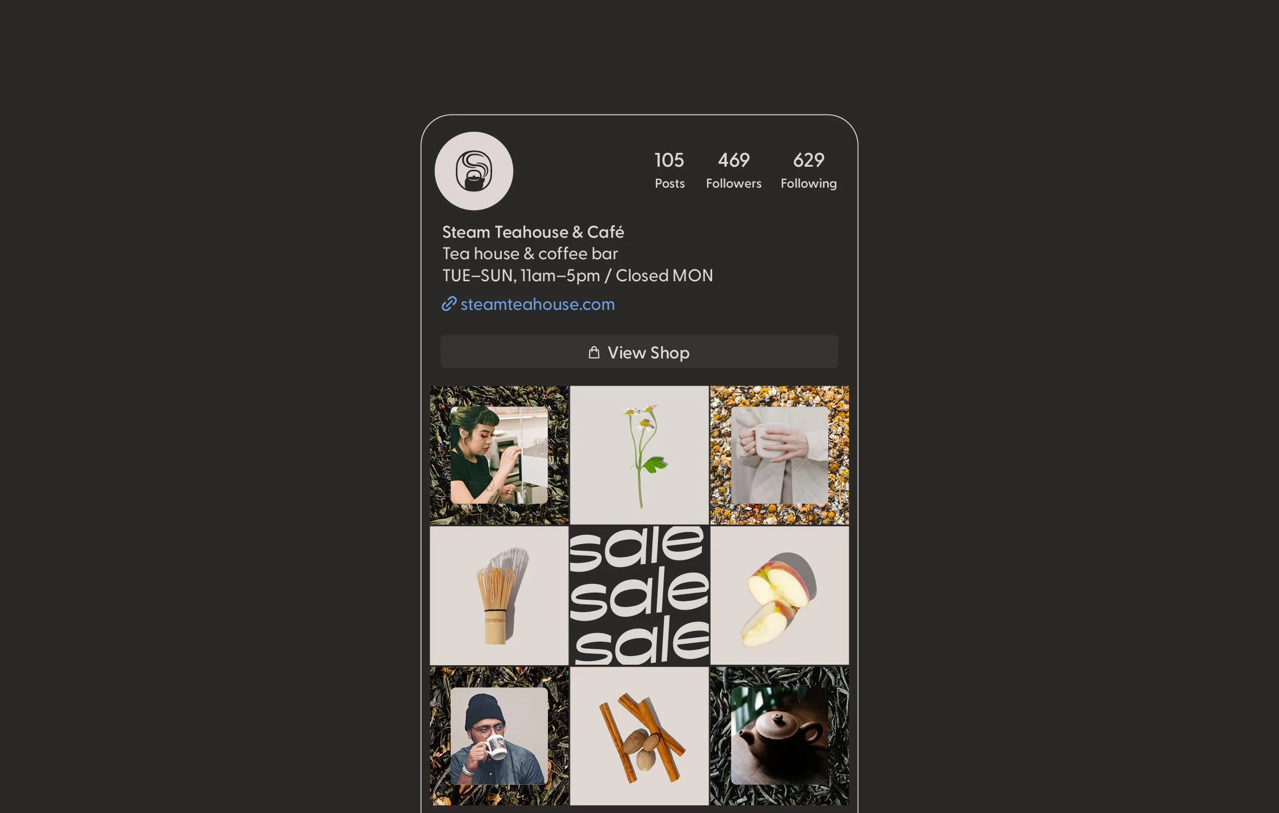
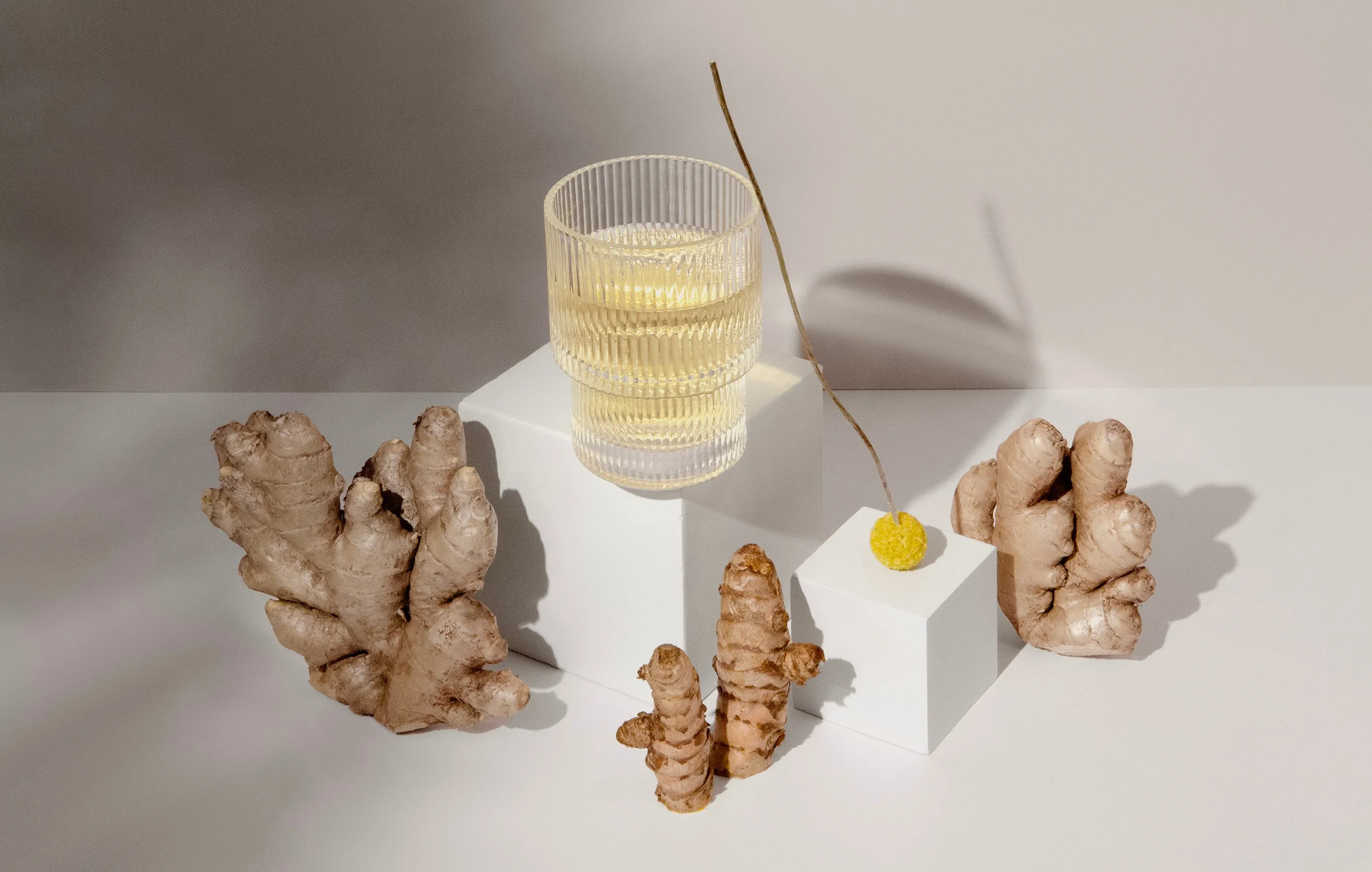
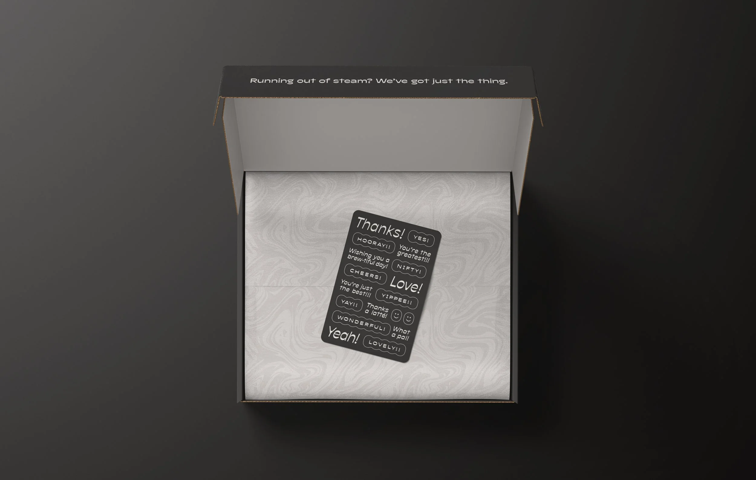
The logo borrows the forms of old stamps used to mark tea crates. Within the logomark, a puff of steam rises from the teapot in the shape of an S, and the mark sits within an ovoid, making it feel cozy and organic. This ovoid shape was used throughout the design to form shapes that symbolize the different types of tea, as well as in glyphs and CTA buttons. Rounded corners throughout brand touchpoints reference the mark and add a welcome softness. A subtle marbled pattern is used throughout as an organic contrast to the geometric shapes, and to reference the mixing of tea and milk along with the beauty of the natural oils that enhance the flavours of the teas. The colours reflect the warm and welcoming nature of the shop and playfully contrast elegant custom photography—vessels literally balanced on the edges of risers along with elements that lean gently against each other—alluding to the artful and perfectly balanced flavours of the teas.
Photography by Aimée Grimes.