THE BRIEF
A growing company with offices across Canada, Best Service Pros sought to simplify their identity and solidify themselves at the best of the best within their sector: always taking initiative, and always endeavouring to improve at all levels of their business.
THE SOLUTION
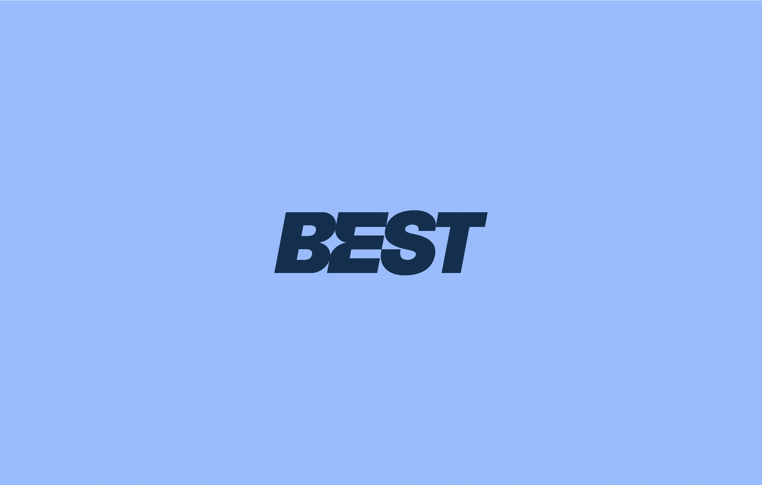
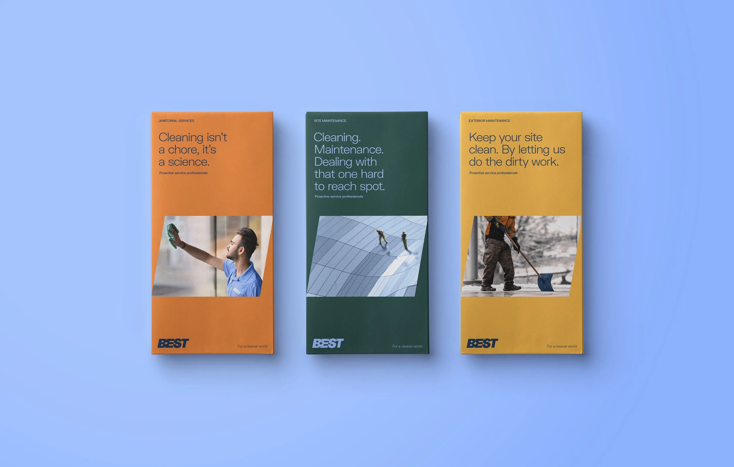
The Best logotype, with its forward slanted angle and hidden star reflects the proactive services they provide as a rising star within their industry: always moving forward, always striving to improve, always making sure that they’re three steps ahead of their clients’ needs, and above all, always ensuring that they live up to their name. The brand colours are fresh, contemporary, and clean, and the gridded layout structure ensures a tidy orderliness to all of our brand applications.