THE BRIEF
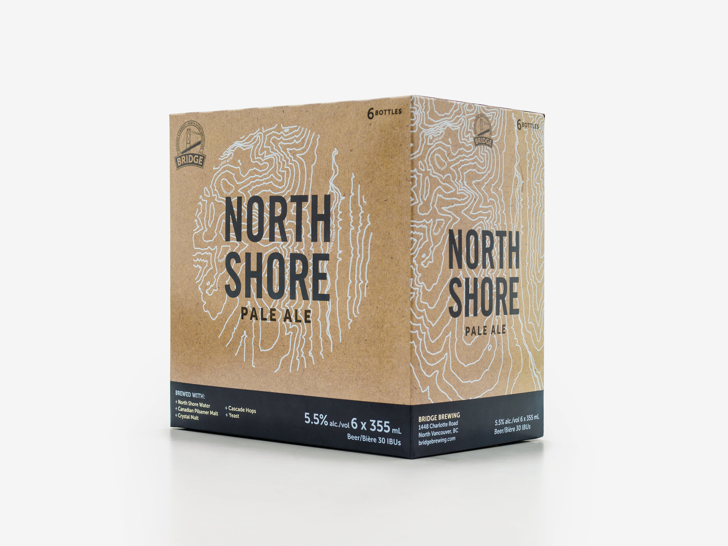
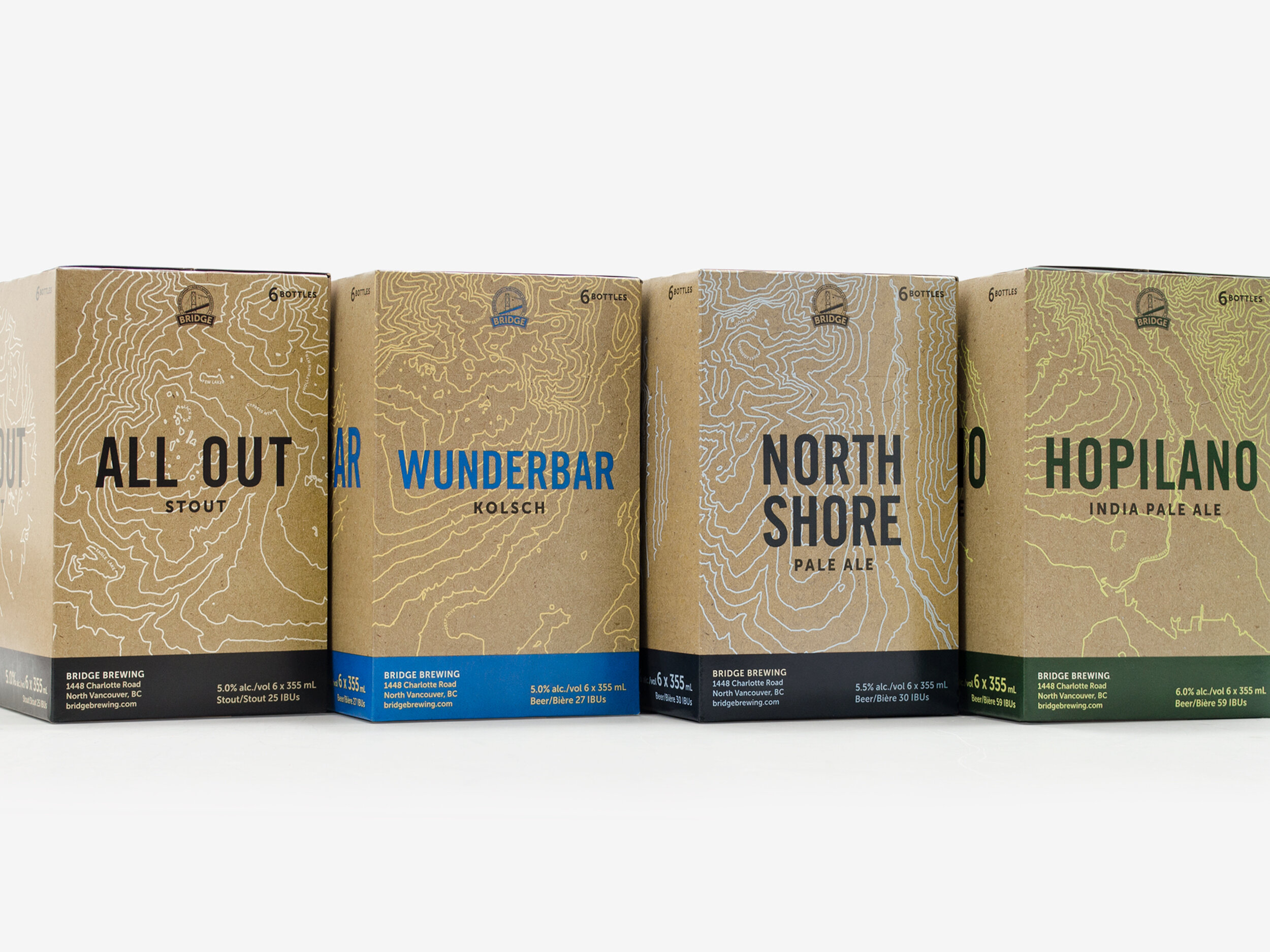
Bridge Brewing wanted to expand their product line with six packs, and were interested in referencing the brewery’s North Vancouver location. Because they are constantly exploring new recipes, the packaging needed to be an adaptable design system that could be applied to new varietals.
THE SOLUTION
An overlay of topographic maps showcases a variety of popular North Shore landmarks that links the beer to the activities and landscapes that their beers celebrate. Each six pack features a different segment of the North Shore mountains. The paper texture and silk-screen-like topographic print references the crafted nature of the product. The design system was developed with their previous can designs in mind, but with lots of positive customer feedback, the new design was quickly expanded to cans and bottle labels. This has been an extremely successful design system for Bridge Brewing, and they have since rolled it out for countless new varietals and seasonal brews.